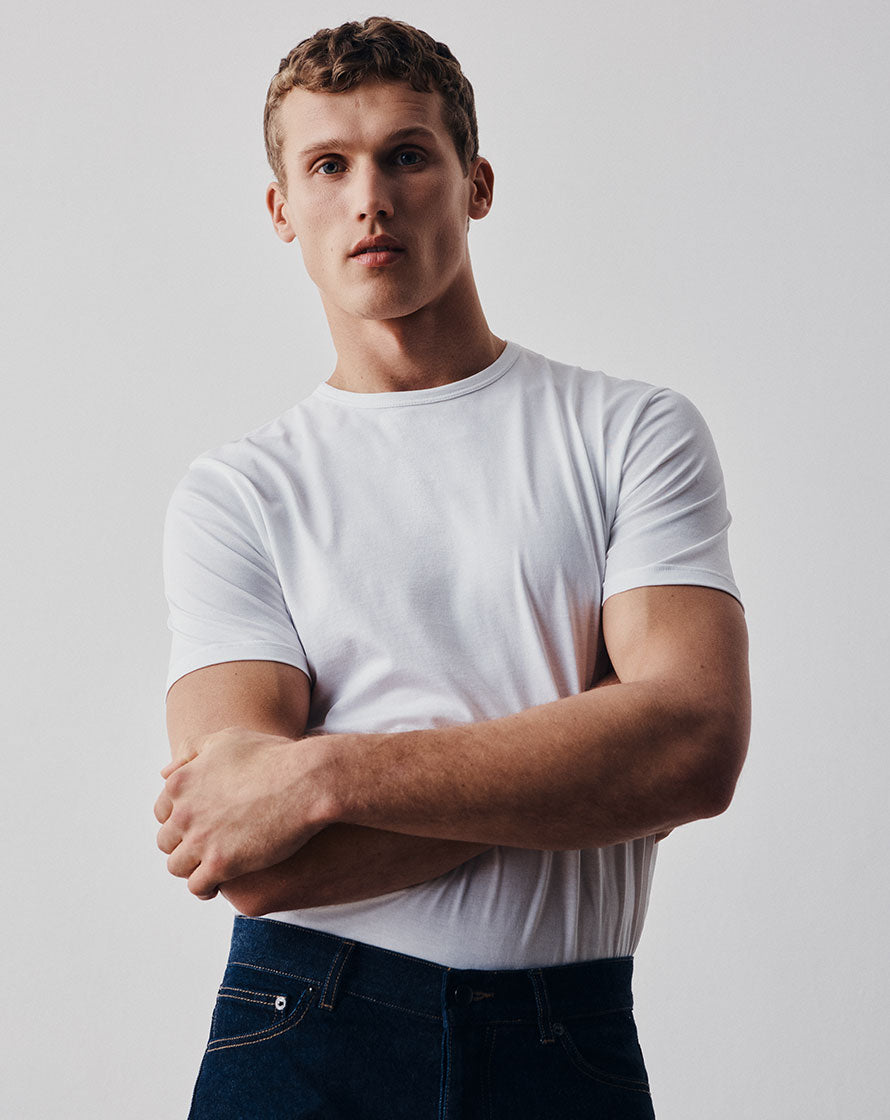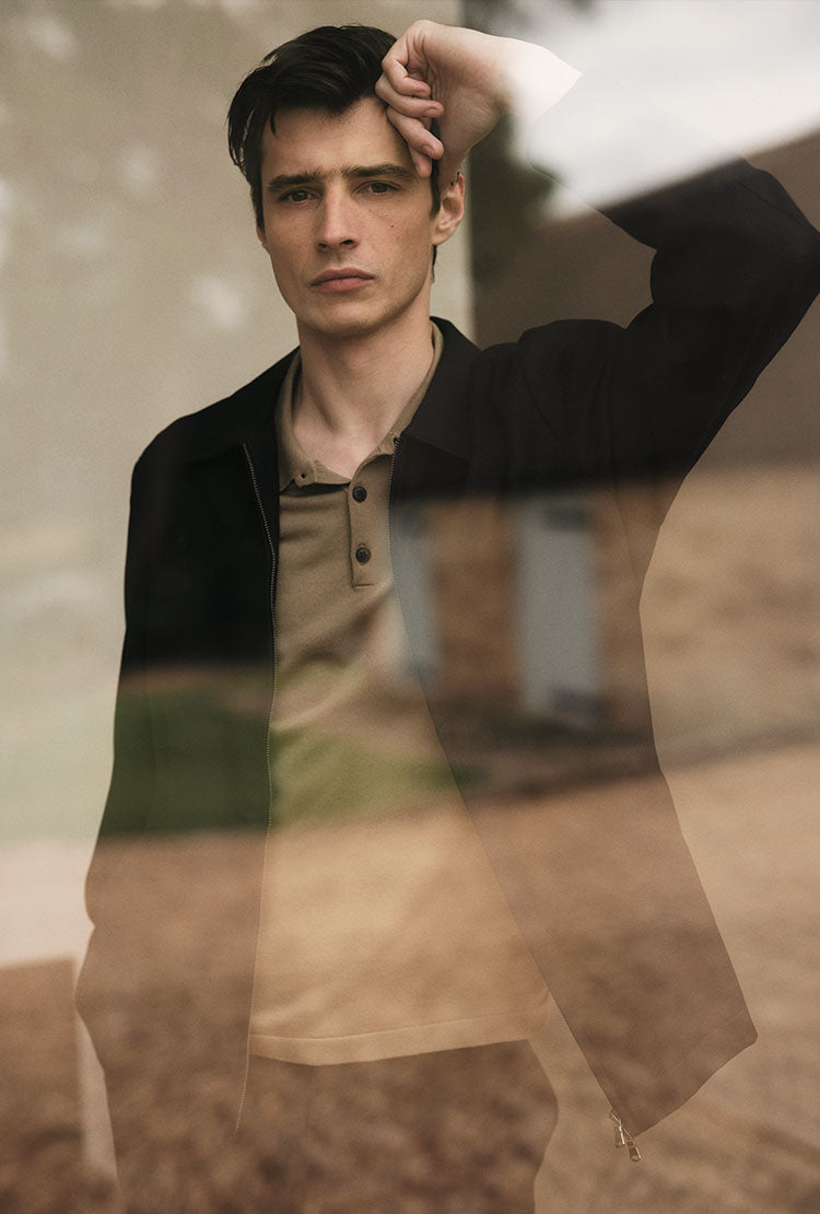
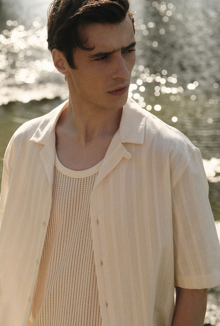
Sunspel and Charlotte Gosch
This season we collaborated with Bristol and Hamburg-based artist Charlotte Gosch. Her vivid photocopied flowers inspired the season’s colour palette and can be found on several of our essential summer products. We spoke to her to find out a little more about her work.
Your technique of photocopying flowers creates such beautiful, vibrant prints. How do you get the colours to be so rich?
Thank you! It’s because of the photocopying technique I use. The lighting is key. Everything is lit exactly the same way because of the nature of photocopying and the way the light hits the flowers. When you look at a flower in the wild or in a photograph, the light comes from one point usually so you have a bit of shadow and the colour isn’t so vivid. But photocopying gives a very different quality. It makes the flowers feel like they’re almost floating and the prints have an eeriness. That’s what’s always fascinated me about it.
Could you tell me a bit about how you choose and arrange the flowers?
Generally, I use the flowers I have in the house or I’ll search for specific flowers if I’ve got an arrangement in my head or know what colour scheme or texture I’m looking for. But I like to work relatively freely. The photocopy plate is my canvas so I start painting with the flowers, using the shapes, textures and colours to create an arrangement.
How did you arrive at the compositions you did with us?
This was really interesting because I normally work in 2D creating a flat print, but because this was for a fabric I had to think differently. I realised it was not going to be still, it would be draped around the body. I decided to have two different compositions and put them together in one big print.

How did you choose the flowers?
I used Sunspel’s fragrances as reference: Sea Moss and Green Cedar. The Green Cedar print had more nuances of greenery but lots of citrusy flavours too, so I added orangey, yellow colours. I used orange and grapefruit Ranunculus and the white flowers to give it that feeling of freshness, while the green around it is really important because it is such a green scent. I bought some of the flowers but I wanted ones that felt personal, and that grow here, so I picked many myself in and around Bristol.
It was a similar process for the Sea Moss print but with more blue. The moss I used has a blue undertone to it and I chose to go with blue and white Anemones as the main feature. Again there’s lots of greenery but it has an underwater feel. The way the Green Ball moves, it feels like the way water would move. Like the Green Cedar print, I used moss that I searched for myself in gardens and forests.
How did you come to work with Sunspel?
David (Sunspel’s creative director) contacted me after I made the singles covers for the last Idles record. I’d made a flower image for each single. They were personal interpretations of the songs and the flowers related to what was happening in the songs.
I’ve always thought of Sunspel as a very British thing (I’m actually German), and I was really excited to work with you. The whole history is amazing and it’s also a very sustainable brand in itself as well which is great!